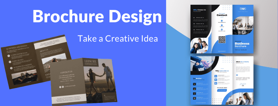
Creative Brochure Design Ideas -2024

Brochures are essential marketing tools that offer a Similar way to communicate with your audience. With 2024 Bringing fresh design trends, it’s Trying to stay ahead of the loop. Whether you’re looking for pamphlet design ideas or Creative brochure design ideas, or unique brochure design ideas, this guidance will Provide you with Complete insights and inspiration. Let’s Begin into the top creative brochure design ideas for 2024 and expaining how you can create an Amazing brochures for various purposes, including school, College, Real Estate Etc projects.
How to Create Effective Brochures Design
Our experts found the Top Competitive trends idea in brochure design for 2024, and we have gathered over 10 of the greatest ideas and examples of brochure design to share with you.
1. Minimalist Elegance
Why It Works ?
Minimalist designs emphasize simplicity and clarity. By using clean lines, ample white space, and a Graceful color palette, these brochures convey professionalism and experience.
How to Achieve It ?
- Color Palette: Stick to two or three colors.
- Typography: Use sans-serif fonts with consistent spacing.
- Layout: Utilize white space effectively to avoid clutter.
Example
A corporate brochure featuring a white background, black text, and a few accent colors can create a sleek and modern look.
2. Bold Typography
Why It Works ?
Bold typography grabs attention and makes a strong visual impact. This design is perfect for making key information stand out.
How to Achieve It ?
- Font Choice: Select bold and legible fonts.
- Contrast: Use high contrast between text and background.
- Hierarchy: Create a visual hierarchy with font sizes and weights.
Example
A tech startup brochure using oversized, bold fonts to highlight their innovative solutions and key benefits.
3. Eco-Friendly Designs
Why It Works ?
Eco Friendly designs resonate with environmentally conscious audiences. Using recycled materials and eco-friendly printing techniques showcases your commitment to sustainability.
How to Achieve It ?
- Materials: Use recycled paper or Biological materials.
- Design Elements: Incorporate earthy tones and nature-inspired graphics.
- Printing: Choose eco-friendly inks and printing methods.
Example
A nonprofit organization’s brochure printed on recycled paper with green and brown hues, promoting their environmental initiatives.
4. Interactive Elements
Why It Works Interactive Unique brochures engage readers more effectively by offering a hands-on experience Elements like pop-ups, flaps, and QR codes can make your brochure more memorable.
How to Achieve It ?
- Pop-Ups and Flaps: Add layers and dimensions to your design.
- QR Codes: Link to online content for additional information.
- Interactive Features: Incorporate games or surveys for engagement.
Example
A travel agency brochure featuring flaps that reveal hidden travel tips and QR codes linking to virtual tours of destinations.
5. Geometric Patterns
Why It Works?
Geometric patterns create visually appealing designs that can guide the reader’s eye through the brochure. This style is versatile and can be adapted to various industries.
- Shapes: Use triangles, circles, and hexagons.
- Patterns: Integrate repeating patterns for a cohesive look.
- Color Coordination: Ensure colors within patterns complement each other.
Example
A fashion brand’s brochure utilizing geometric patterns in pastel colors to showcase their latest collection.
6. Vintage Revival
Why It Works ?
Nostalgic designs can evoke emotions and appeal to a sense of history and tradition. Vintage styles can be both charming and timeless.
How to Achieve It ?
- Color Scheme: Use sepia tones, muted colors, and retro hues.
- Typography: Choose fonts reminiscent of historical periods.
- Graphics: Incorporate vintage illustrations and textures.
Example
A coffee shop’s brochure designed with vintage typography and sepia-toned images, highlighting their classic brews and rich history.
7. Gradient Overlays
Why It Works ?
Gradients add depth and dimension to flat designs, creating a visually dynamic effect. They can make your brochure look modern and trendy.
How to Achieve It?
- Color Blends: Use complementary colors for smooth transitions.
- Layering: Apply gradients over images or as backgrounds.
- Subtlety: Ensure gradients are not overwhelming and enhance readability.
Example
A tech company’s brochure with gradient overlays in blues and purples, emphasizing innovation and futuristic thinking.
8. Illustrative Art
Why It Works Custom illustrations Art adds a personal touch and can tell a unique story. This approach is perfect for brands looking to showcase creativity and Personally.
How to Achieve It ?
- Illustration Style: Select a Common style that matches your brand’s personality.
- Integration: Blend illustrations Logically with text and other elements.
- Consistency: Maintain a consistent theme alover the brochure.
Example
A children’s book publisher’s brochure filled with volatile illustrations that bring their stories and characters to life.
9. Photography Focused
Why It Works
High-quality images can capture attention and convey messages more effectively than text alone. This design is ideal for visual-driven industries.
How to Achieve It?
- Image Quality: Use high-resolution, professional photographs.
- Balance: Ensure text and images complement each other.
- Focus: Highlight key images that represent your message.
Example
A real estate agency’s brochure showcasing stunning property photos with brief and descriptive text to invite potential buyers.
10. Fold-Out Maps
Why It Works
Fold-out maps add an element of surprise and interactivity. They are particularly useful for brochures that involve travel, exploration, or large amounts of information.
How to Achieve It?
- Folding Technique: Use creative folding methods to reveal maps.
- Durability: Ensure the brochure can withstand repeated unfolding.
- Clarity: Design maps that are easy to read and navigate.
Example
A city tourism brochure featuring a fold-out map of attractions, restaurants, and landmarks.
11. Monochrome Palettes
Why It Works?
Monochrome designs use variations of a single color, creating a cohesive and striking look. This approach simplifies design while maintaining visual interest.
How to Achieve It?
- Shades and Tints: Use different shades and tints of one color.
- Contrast: Ensure sufficient contrast for readability.
- Accent Elements: Include small accents of contrasting colors for emphasis.
Example
A fitness brand’s brochure using various shades of blue to create a unified and energetic appearance.
How pamphlet Design idea relates to Brochure Design ?
Pamphlet design Idea and brochure design share many similarities and can often overlap in their Creative brochure design idea concepts and Implementation. Both tools are for gathering information effectively, with the goal of engaging the reader and delivering a clear message. Pamphlets are typically single sheets of paper folded into sections similarly while brochures can be more complex with multiple pages or elaborate folds. Because of these differences, the principles of good design apply to both formats.
When designing either a pamphlet or a brochure, it's essential to focus on Quality and Clarity. The layout should be clean and well Designed with a balanced use of text and images. Typography plays a Major role in both, as it needs to be readable. Colors should be chosen carefully to match the branding Eye catching. It Should be a desired emotional response from the audience.
Focus on the target audience is crucial in both pamphlets and Creative brochures. The content should be converted to their interests and needs using language and visuals that will resonate with them. Both Brochure design idea formats benefit from a strong call to action guiding the reader toward the next step. whether it's visiting a website or making a purchase and attending an event.
Brochures Temphlet Design Idea
Distribution methods also influence design decisions. Whether the material is handed out in person, mailed, or Hand made available online. The Unique Brochures Templates design idea should be suitable for the chosen method of distribution. Additionally. considerations of cost and production play a role in the design process. Choices regarding paper quality, printing techniques, and any additional finishes must balance budget constraints with the desired impact.
In essence, pamphlet Design and Simple brochure designs may differ in complexity format. The underlying principles of effective design, audience engagement, and clear communication remain consistent across both mediums.
Conclusion
Finally thoroughly and seek feedback to refine the design, ensuring it effectively communicates With your messages and engages your audience. Creating a brochure design involves understanding its purpose and the audience it aims to reach. The content should be engaging, clear with a strong call-to-action to guide the readers toward response. so use high-quality images, a cohesive color scheme, and consistent typography to make the brochure attractive and professional.
Ensure the design aligns with your brand’s identity, maintaining a consistent tone and style. Organize the information logically, using headings and bullet points to enhance readability.Consider the brochure’s format, ensuring it works well in both print and digital formats, paying attention to technical details like bleed and resolution.
FAQ
1.What makes a brochure unique?
It's not necessary for a brochure to be a bi-fold booklet. Fold designs are a powerful tool for making your brochure stand out by improving its look to something more lively and open than typical. Consider creating a tri-fold brochure or something more visually striking.
2.What is the main purpose of a brochure?
A brochure is a promotional material that is generally intended to introduce a business, organization, goods, or services and highlight their advantages to potential clients or the general public.
3.What brochure format works best?
- Tri-fold: The most popular layout is the tri-fold, a single sheet of paper folded into thirds.
- French fold: A French fold is created by folding a sheet of paper vertically and then horizontally.
- Gate fold
- Double gate fold.
- Double parallel fold.
- Spiral fold.
- Designing for your fold.
4.Who needs a brochure?
For trade shows, live events, sales, and exhibitions, brochures work wonders. tool for merchandisers. A fantastic strategy to draw in new clients is to distribute branded samples or stuff.
5.What is the main idea of a brochure?
A brochure is a cost-efficient, polished, and professional tool to inform your target audience. They are meant to be picked up by individuals. A retail or tourist business might advertise itself by putting brochures in a rack at hotels, motels, and tourist information centers.


Post a Review